Differenze tra le versioni di "Sandbox"
| (481 versioni intermedie di 2 utenti non mostrate) | |||
| Riga 1: | Riga 1: | ||
| − | = | + | = Contemplating the Rondanini Pietà = |
| − | + | '''''Maria Angela Padoa Schioppa''''' -- Sunday, June 11th 2006 | |
| − | + | Today I went to visit the Pietà Rondanini at the Castello Sforzesco. I've tried to write down the thoughts and feelings it aroused in me. | |
| − | + | If you observe the whole statue from various perspectives, you are led in a movement that from the curve of Christ's feet to the right continues climbing with a curve to the left up to Mary's head, and then descends along Mary's entire back until it rejoins the feet of the Son. | |
| + | ---- | ||
| + | {| style="border-spacing:0;" | ||
| + | |- style="vertical-align:top;border:none;padding-top:0cm;padding-bottom:0cm;" | ||
| + | || | ||
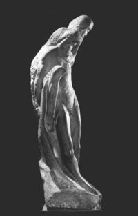
| + | Seen from the right side, a curved line stands out that runs through the whole statue as in a single large well-characterized movement: as if to express, in my opinion, the mental attitude of someone who - in the face of severe pain experienced - does not stiffen in a straight position and petrified, but instead "moves" with a multiplicity of inner attitudes (concentration, gentleness, strength, acceptance...) surrounded and supported by a large curved gesture of protection that contains them all in itself. | ||
| + | |||
| + | I was particularly struck by the deep curve of Mary's back, which can be observed from the rear: it is imposing and seems to physically express how strong the experience of total commitment and dedication to support the other can be at certain moments, when at the moment of loss of vital forces and exhaustion. | ||
| − | + | It makes one think of the ability in man to take charge of the other, or to the strength of com-passion. | |
| + | | align=center| [[File:pieta-rondanini_1b.jpg|border|right|thumb|200px|link=pieta-rondanini_1b.jpg]] | ||
|- | |- | ||
| − | |||
| − | |||
|} | |} | ||
| + | ---- | ||
| + | {| style="border-spacing:0;" | ||
| + | |- style="vertical-align:top;border:none;padding-top:0cm;padding-bottom:0cm;" | ||
| + | || | ||
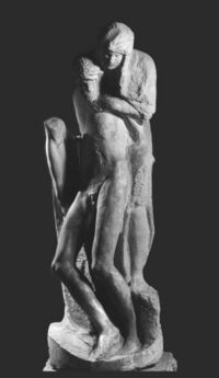
| + | If you look at the statue from the front, it can almost seem that it is the Son who is supporting Mary, while seen from the back it is seen that it is Mary who is holding the lifeless Christ in her arms. | ||
| − | = | + | This made me think that of a "therapeutic" experience of participation and support; for example, of a doctor towards a patient or a parent towards a child in difficulty, or in many other cases, the inner enrichment that arises is always reciprocal and, at least potentially, it's never in just one direction. |
| + | | align=center| [[File:pieta-rondanini_2b.jpg|border|right|thumb|200px|link=pieta-rondanini_2b.jpg]] | ||
| + | |- | ||
| + | |} | ||
| + | ---- | ||
| + | {| style="border-spacing:0;" | ||
| + | |- style="vertical-align:top;border:none;padding-top:0cm;padding-bottom:0cm;" | ||
| + | || | ||
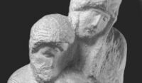
| + | The two faces of Christ and Mary, in some respects very similar but also very different, seem to express a multiplicity of feelings and moods: concentration, commitment, seriousness, pain but not despair, calm? serenity... and they almost seem to lead those contemplating them to see how the human being can transform himself on his journey of disembodiment towards the spiritual world, when he approaches the threshold of death. Death on earth and birth to the spirit world. | ||
| − | + | The two figures express a profound union between them that almost borders on the fusion of the two bodies, so much so that in some parts it is not easy to distinguish the body of Christ from that of Mary. But on the other hand, the two individualities clearly stand out. | |
| − | + | This can be a symbol of those life experiences in which symbiosis and otherness are experienced at the same time. | |
| − | + | | align=center| [[File:pieta-rondanini_3b.jpg|border|right|thumb|200px|link=pieta-rondanini_3b.jpg]] | |
| − | [[File: | + | |- |
| + | |} | ||
| + | ---- | ||
| + | {| style="border-spacing:0;" | ||
| + | |- style="vertical-align:top;border:none;padding-top:0cm;padding-bottom:0cm;" | ||
| + | || | ||
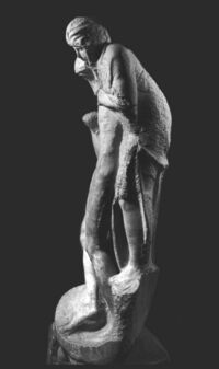
| + | If you look at the statue from the left side, you can see the broad and strong gesture with which Mary supports the inert body of Christ: it seems that she is resting him on her lap, between her legs, to better support him with all her strength. | ||
| − | + | This position of Mary reminded me of the gesture of giving birth. | |
| − | + | A circle closes for Mary between the birth and death of her Son, in two similar and polar gestures: "giving birth" and "supporting in dying out", the alpha and omega of a journey. | |
| − | + | The statue evidently bears the contrast and the coexistence in the same work between the perfectly smooth, completed parts and the chiseled and scratched, incomplete parts, between harmonious and plastic bodily forms, and other only sketched, almost disembodied forms. | |
| − | + | | align=center| [[File:pieta-rondanini_4b.jpg|border|right|thumb|200px|link=pieta-rondanini_4b.jpg]] | |
| − | |||
| − | |||
| − | |||
| − | |||
| − | = | ||
| − | |||
| − | |||
| − | |||
| − | |||
| − | |||
| − | |||
|- | |- | ||
| − | |||
| − | |||
|} | |} | ||
| − | |||
| − | |||
| − | |||
| − | |||
| − | |||
| − | |||
| − | |||
| − | |||
| − | |||
| − | |||
| − | |||
| − | |||
| − | |||
| − | |||
| − | |||
| − | |||
| − | |||
| − | |||
---- | ---- | ||
| − | + | {| style="border-spacing:0;" | |
| + | |- style="vertical-align:top;border:none;padding-top:0cm;padding-bottom:0cm;" | ||
| + | || | ||
| + | It seems to me that the sketched part makes this Pietà particularly special and evocative, almost as if Michelangelo wanted to offer anyone who contemplates it the possibility of "continuing the work" - with his own thought and heart - finding within himself so many possible messages and impulses, aroused precisely by the fact that the work is only sketched and not completed. | ||
| + | | align=center| [[File:pieta-rondanini_5b.jpg|border|right|thumb|200px|link=pieta-rondanini_5b.jpg]] | ||
| + | |- | ||
| + | |} | ||
Versione delle 19:51, 20 giu 2023
Contemplating the Rondanini Pietà[modifica]
Maria Angela Padoa Schioppa -- Sunday, June 11th 2006
Today I went to visit the Pietà Rondanini at the Castello Sforzesco. I've tried to write down the thoughts and feelings it aroused in me.
If you observe the whole statue from various perspectives, you are led in a movement that from the curve of Christ's feet to the right continues climbing with a curve to the left up to Mary's head, and then descends along Mary's entire back until it rejoins the feet of the Son.
|
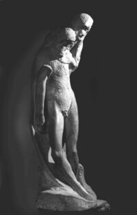
Seen from the right side, a curved line stands out that runs through the whole statue as in a single large well-characterized movement: as if to express, in my opinion, the mental attitude of someone who - in the face of severe pain experienced - does not stiffen in a straight position and petrified, but instead "moves" with a multiplicity of inner attitudes (concentration, gentleness, strength, acceptance...) surrounded and supported by a large curved gesture of protection that contains them all in itself. I was particularly struck by the deep curve of Mary's back, which can be observed from the rear: it is imposing and seems to physically express how strong the experience of total commitment and dedication to support the other can be at certain moments, when at the moment of loss of vital forces and exhaustion. It makes one think of the ability in man to take charge of the other, or to the strength of com-passion. |
|
If you look at the statue from the front, it can almost seem that it is the Son who is supporting Mary, while seen from the back it is seen that it is Mary who is holding the lifeless Christ in her arms. This made me think that of a "therapeutic" experience of participation and support; for example, of a doctor towards a patient or a parent towards a child in difficulty, or in many other cases, the inner enrichment that arises is always reciprocal and, at least potentially, it's never in just one direction. |
|
The two faces of Christ and Mary, in some respects very similar but also very different, seem to express a multiplicity of feelings and moods: concentration, commitment, seriousness, pain but not despair, calm? serenity... and they almost seem to lead those contemplating them to see how the human being can transform himself on his journey of disembodiment towards the spiritual world, when he approaches the threshold of death. Death on earth and birth to the spirit world. The two figures express a profound union between them that almost borders on the fusion of the two bodies, so much so that in some parts it is not easy to distinguish the body of Christ from that of Mary. But on the other hand, the two individualities clearly stand out. This can be a symbol of those life experiences in which symbiosis and otherness are experienced at the same time. |
|
If you look at the statue from the left side, you can see the broad and strong gesture with which Mary supports the inert body of Christ: it seems that she is resting him on her lap, between her legs, to better support him with all her strength. This position of Mary reminded me of the gesture of giving birth. A circle closes for Mary between the birth and death of her Son, in two similar and polar gestures: "giving birth" and "supporting in dying out", the alpha and omega of a journey. The statue evidently bears the contrast and the coexistence in the same work between the perfectly smooth, completed parts and the chiseled and scratched, incomplete parts, between harmonious and plastic bodily forms, and other only sketched, almost disembodied forms. |
|
It seems to me that the sketched part makes this Pietà particularly special and evocative, almost as if Michelangelo wanted to offer anyone who contemplates it the possibility of "continuing the work" - with his own thought and heart - finding within himself so many possible messages and impulses, aroused precisely by the fact that the work is only sketched and not completed. |
